My local Giant supermarket (known as Stop & Shop in the Northeast, and tortuously related to the Pennsylvania-based Giant supermarkets and the Martin’s chain) underwent a major remodeling recently. I wrote about the great beer and wine sales they had here, but this post is about supermarket buildings.
One thing that distinguishes supermarkets from other common retail is the “décor package” or interior design. Many box stores lack department or aisle signage, and in general have drab and relatively generic fixtures, color schemes, etc. Supermarkets, on the other hand, usually show much more attention to detail on these matters. In the industry, the entire set of interior design elements, from the aisle signs to the department signs to the checkout machine styling to the floors, is known as a “décor package.”
Giant, for example, previously used a colorful scheme, with a purple clock on the front and back wall, a distinctive retro-looking purple arrow pointing to the restrooms, and more. The new scheme is more muted and “upscale,” with departments advertised by faux white-brick signs, for example. A while back, along with other changes, my local Harris Teeter tore out the whimsical, massive 3D models of ice cream containers that hung above the dairy department, and replaced them with an ordinary flat sign. Most likely, this change was handed down from corporate.
If you know what years a supermarket actively used a particular décor package, you can date any location which retains it to those years (though of course the building itself could be older). However, décor packages are generally updated chain-wide, just like new logos and exterior signage. Giant appears to be introducing its new décor package slowly, but in a few years, there may not be any surviving Giant supermarkets that still retain the purple clocks and arrows.
At least, not locations still operated by Giant.
In Herndon, a few miles from Reston at the western edge of Fairfax County, Virginia, is an H-Mart that inhabits a fairly old former Giant building. The Korean grocer took over the space in late 2018, and, curiously, opted not to remodel the interior. An H-Mart further east in Fairfax also took over a vacated Giant location with the same interior, but completely redid both the décor and the interior arrangement. (They were moving out of an old SuperFresh, an A&P brand.) The Herndon location is in a somewhat poorer, heavily Hispanic neighborhood—its inventory even skews towards Latin foods, including frozen whole skinned iguanas—and so perhaps corporate doesn’t view it as a “flagship” store that needs money for mostly cosmetic improvements.
Because of this, the Herndon H-Mart is an extremely well-preserved example of a Giant supermarket from the early 2010s—that purple-skewed décor package was described as “brand-new” in 2012, for a newly opened location north of Baltimore in Maryland. (Here’s the page for the Google reviews of that store, with photos of its interior. And here’s a photo of a much older Giant décor package.)
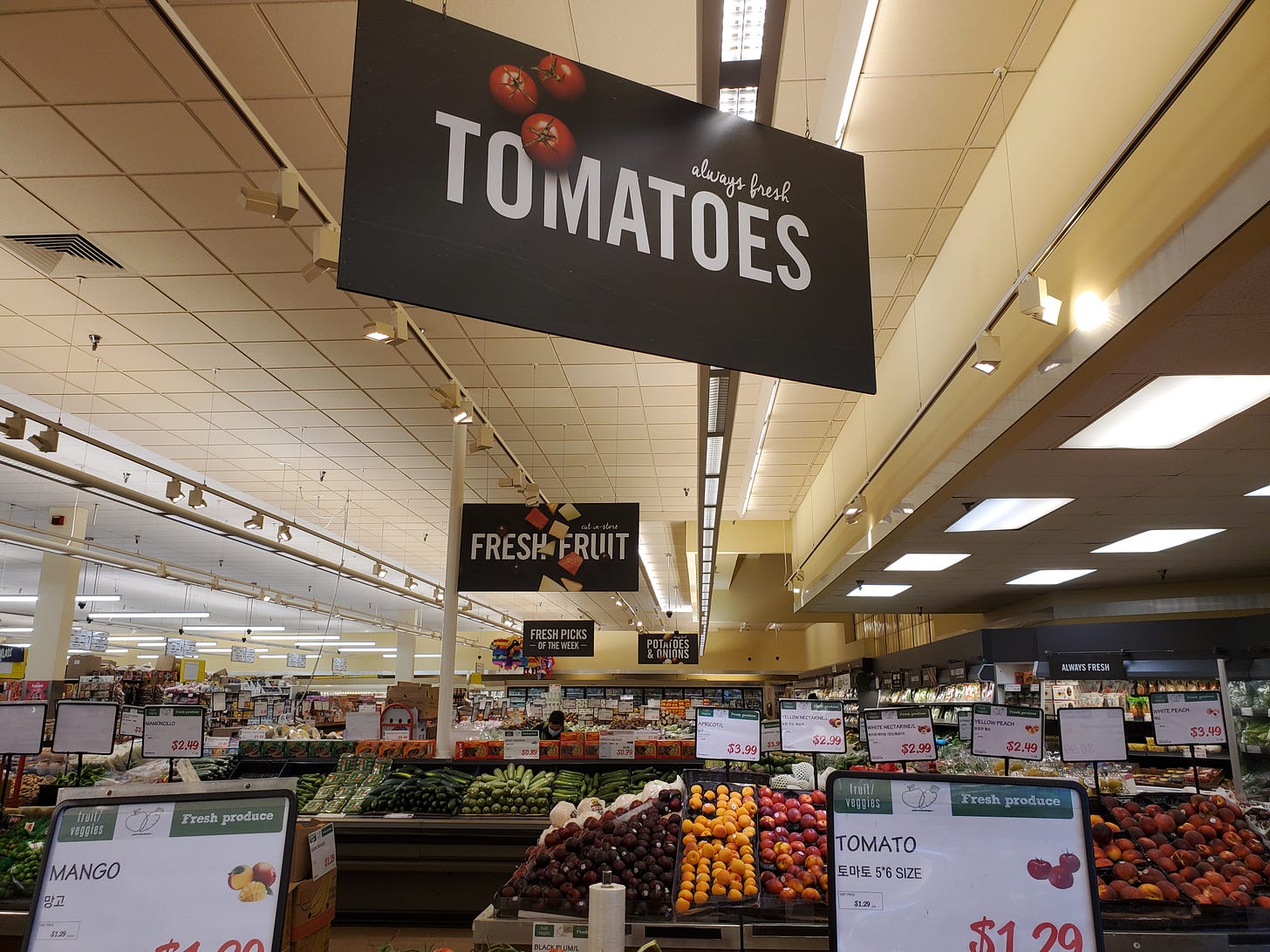
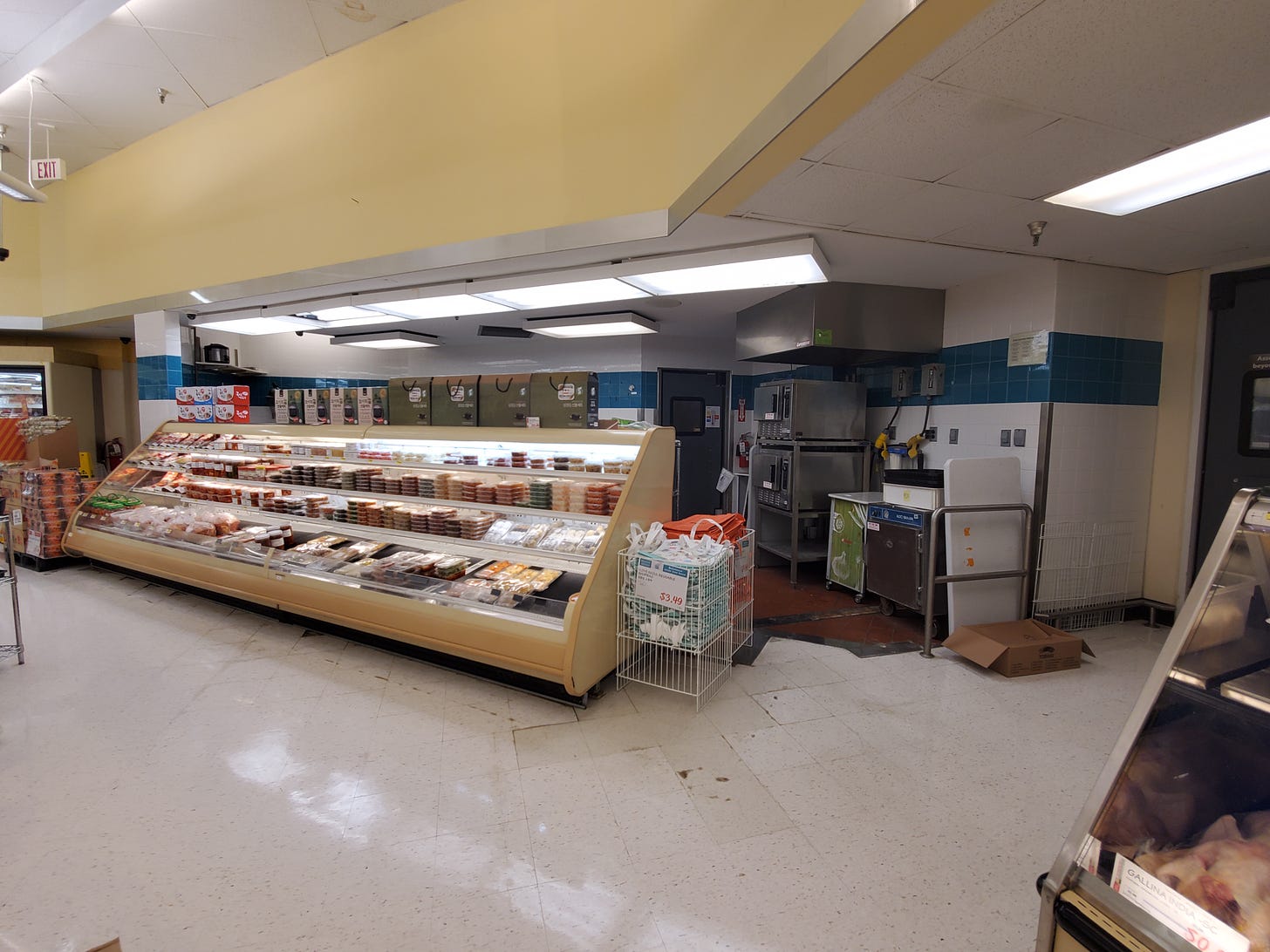
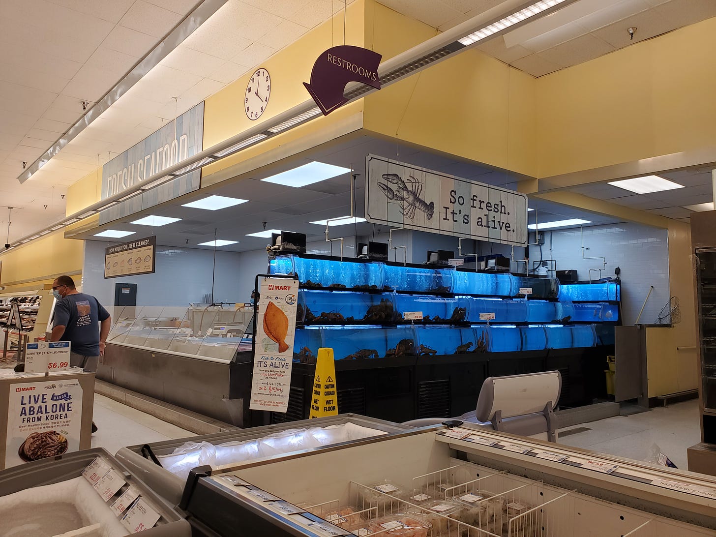
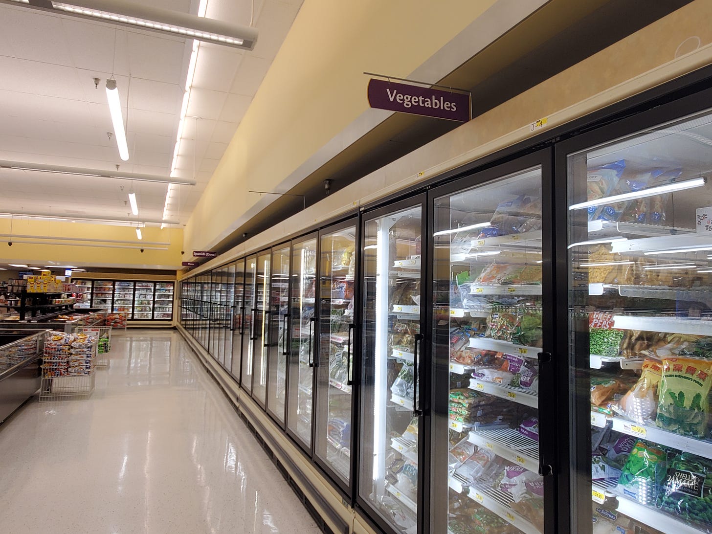
Here are some shots of the H-Mart’s interior. Some of the signage above the departments has been altered, and some of the space is used differently, but a passing familiarity with Giant interiors would quickly give its past away.
In fact, this store is almost like a microcosm of a traditional city. It hasn’t been gutted and redone all at once. When I first shopped there around Christmas 2018, no interior alterations had been made. Now, you can see little by little how the space has been adapted to the needs of a Korean-focused grocery store, though without any superfluous cosmetic changes.
Take the fish department. The original Giant fish counter, with its almost perfunctory display of frozen tuna, salmon, cod, tilapia, and shrimp, and its shelves of jarred herring and fake crab, has been turned into some extra shelving, perhaps waiting for some more innovative use to come.
The pharmacy, which is often nonexistent or considerably smaller in international supermarkets, has been adapted into a proper fish department, complete with tanks of live fish and crustaceans. (In the beginning, the former pharmacy was simply stacked with extra cases of beverages.) And there’s the purple arrow and the clock! The old fish area, however, still has the blue tiles this Giant model used for that department.
The Giant slicing deli, which was previously retained with the display cases holding Korean BBQ and banchan, has been torn out and turned into a small food court, a diminutive version of the “food hall” that takes up over a third of the fancier Fairfax H-Mart’s floor space. But as with the old fish counter, the food court still retains Giant’s white-and-purple deli-department tiles.
The aisle freezers have been pulled out, and replaced with island freezers or fridges, as well as a much larger dry goods and household section. There’s more than a whole aisle of cooking implements, pots and pans, electric appliances, and more. The old Giant freezer signs also remain, with one, which reads “Spanish (Goya),” particularly fitting for this store.
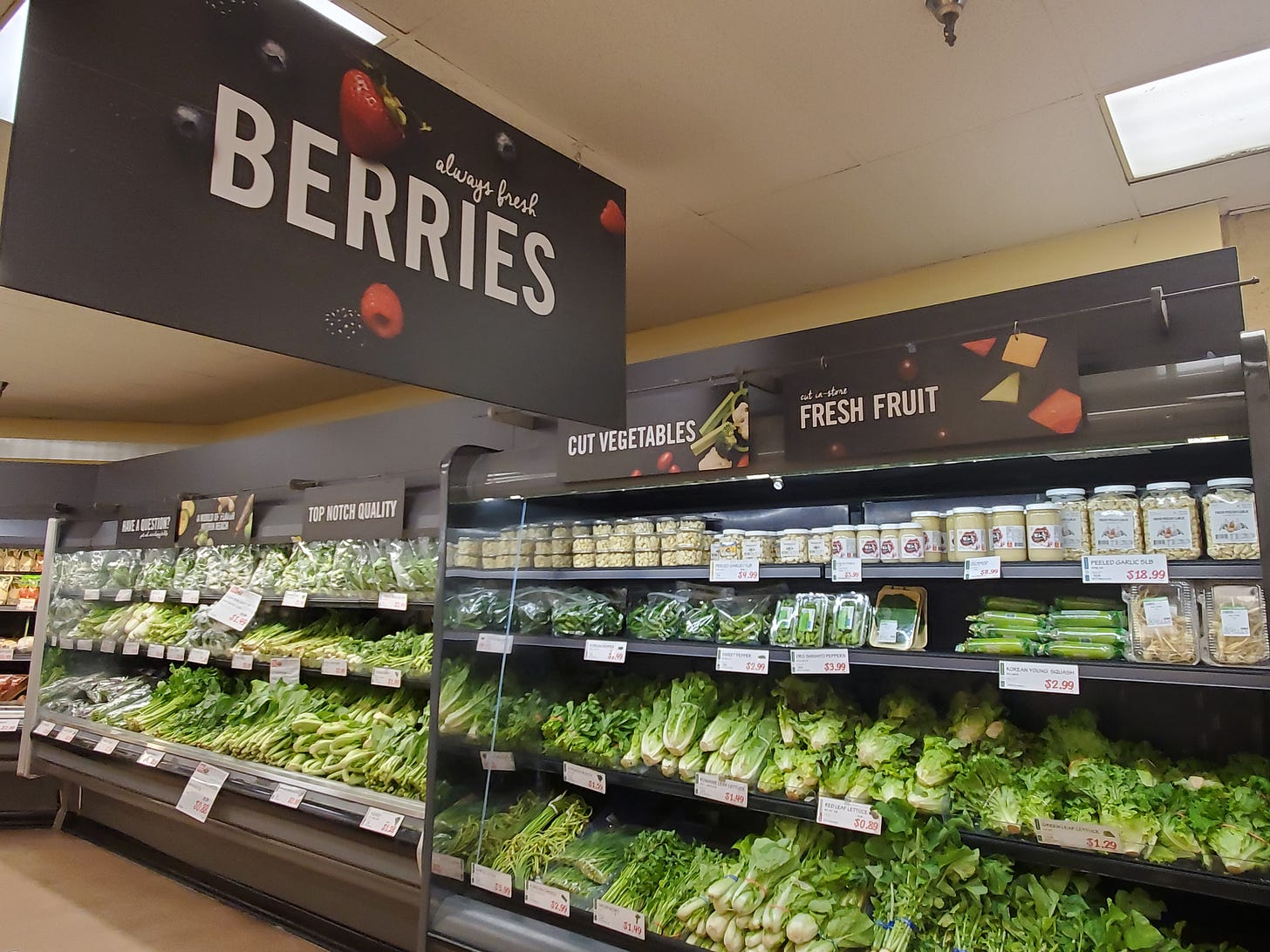
You can see the slightly odd fit of new and old, and you can make out some untouched Giant features. Go back to the entrance/produce photo above, and the photo below. All the signage is original to Giant, despite the fact that it barely matches the selection or arrangement of the new produce department. No water spinach, giant radish, or AA choy on those signs. Peeled garlic tubs now sit under “Fresh Fruit.” Asian fruit varieties sit next to berries. Maybe stores like this are microcosms not only of traditional cities, but also of diversity and organic change. Like this region overall.
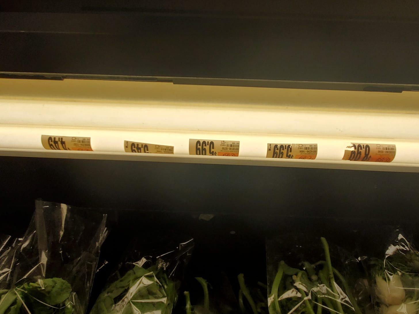
In a set of shelves in the produce department, I even spotted this fluorescent bulb with several Giant price stickers still stuck on it, two and a half years later!
And so, oddly enough, the obsessive drive towards corporate standardization means that quite often the only way for previous décor packages or even entire era-specific buildings to be preserved—McDonald’s, for example, has consistently remodeled or even demolished “obsolete” building models—is for those buildings to fall out of the chain and end up in the hands of smaller chains or independent businesses. Or in this case, a larger chain, with some very modern stores, that has deprioritized a particular location.
Often, these new owners or tenants either lack the cash to aggressively remodel their buildings, or simply don’t care to do so. There’s no corporate office to tell them what to do. They tend to be international supermarkets, catering to families who often skew working class and are probably more interested in value than décor. They rarely build their own stores, and don’t really have trademark décor packages. All of those expenses have nothing to do with the food, after all. What’s the point? And so cast-off brand-centric architecture enters a sort of architectural pubic domain.
Here’s another neat example. A very old A&P in Hillsborough, New Jersey, was subdivided quite awhile ago into a large liquor store and smaller produce market. In the produce market section, the old A&P department signs still hang on the wall!
I’ll be returning to this idea, but from a different angle next time, looking at a different supermarket. Keep your eyes out!
Related Reading:



I have always wondered about the multiple Giants but never looked it up. Apparently they are related, but only because they were acquired by the same company. They just seem to be grocery chains in neighboring markets that had the same name. I also looked up Giant Eagle. It's also seemingly unrelated, and started as Eagle but then added on "Giant" after an acquisition of a large chain (that was named OK, not Giant).