I write fairly often about supermarkets. I find them interesting as a business and as a retail form. And their history is in a lot of ways a microcosm of the history of America’s built environment.
Last year, for Strong Towns, I wrote about the history of the supermarkets in my hometown of Flemington, New Jersey, and how their trajectories over the decades captured our general shift away from compact, urban development and towards a sprawling, car-dependent pattern.
It happens that one large, modern supermarket in a strip plaza outside Flemington can trace its existence all the way back to the late 1950s, right on Main Street. I assume this is the case for many towns with a penumbra of sprawl around them (often outside of city limits): one or two of the modern supermarkets there might have originated decades ago as small neighborhood grocery stores on Main Street.
This is interesting as a historical matter. But it’s also not that long ago. It really wasn’t until the 1970s that we stopped building new small- or medium-sized grocery stores in existing downtowns, or within the old street grid.
I go over all of that, with a bunch of photos and examples, in that Strong Towns piece.
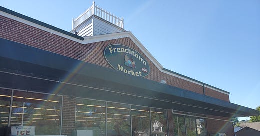
But for today’s post I want to show you one of these supermarkets in detail. I’m going to show you a former (originally) A&P, of a size that was built throughout the 1960s and maybe into the early 1970s. This particular store was built in 1960, and it’s only about 10,000 square feet (so it’s not surprising that these stores are often taken over by chain pharmacies.)
However, this one is still a supermarket, and has been one continuously since 1960. In 2005, not long after A&P vacated the space, an IGA branch opened up here, and has been open ever since. They’ve left the building pretty much intact, so it’s still a very good example of what a midcentury neighborhood grocery store looked like.
This store is not downtown, but it is within Frenchtown’s street grid—curiously not really near any other businesses.
And, in fact, this was not Frenchtown’s first A&P. The first one dates back to 1900, and it was in the core downtown (the far left side of the map above). Think about that: for as long as this “new” A&P has served this little town—about 60 years—a small downtown grocery store preceded it.
So here it is.
As you can see from the exterior shot above, it has a decently sized parking lot, but it’s also right across the street from a block of houses. A grocery store of this scale can accommodate motorists while also fitting comfortably into the walkable grid system. Most customers won’t be driving from far away; many won’t be driving at all.
All of the departments are small, but none are obviously missing. There’s a lot less drug, pharmacy, and household/non-food merchandise here, but there’s still some.
And there’s still a slicing deli and a frozen section, and a perfectly serviceable produce and meat section (the fish section, as with many smaller supermarkets, is pretty small.)
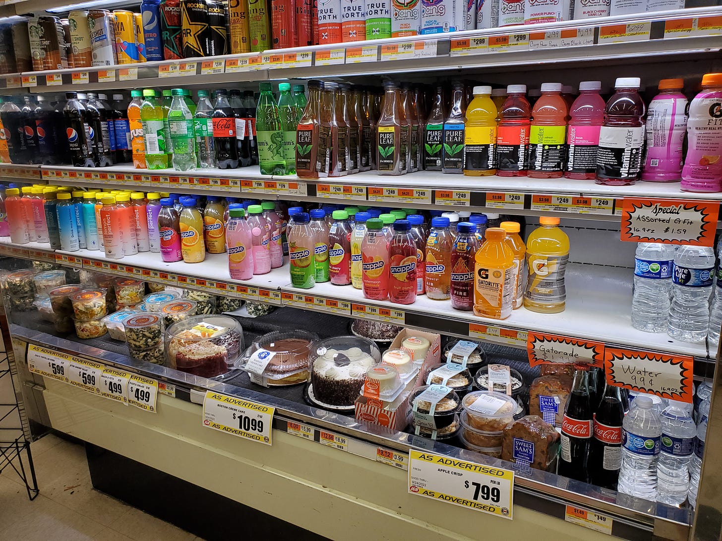
The bakery consists of the bread bins on the right in the photo above, and this little shelf of cakes to their left:
How are the prices? Not bad! I found a couple of pretty good prices on meat, in fact. Generally you’ll pay a little more for most things, but when you consider the gas money to drive from here to that Flemington ShopRite mentioned above—the closest supermarket—it’s probably about the same.
So as you can see, these stores can pack quite a bit of merchandise in a very small footprint, partly by truncating or eliminating marginal departments, and partly by using their limited space very efficiently. They’re almost like microcosms of cities, in that way. When you have limited space, you get denser. It’s very interesting.
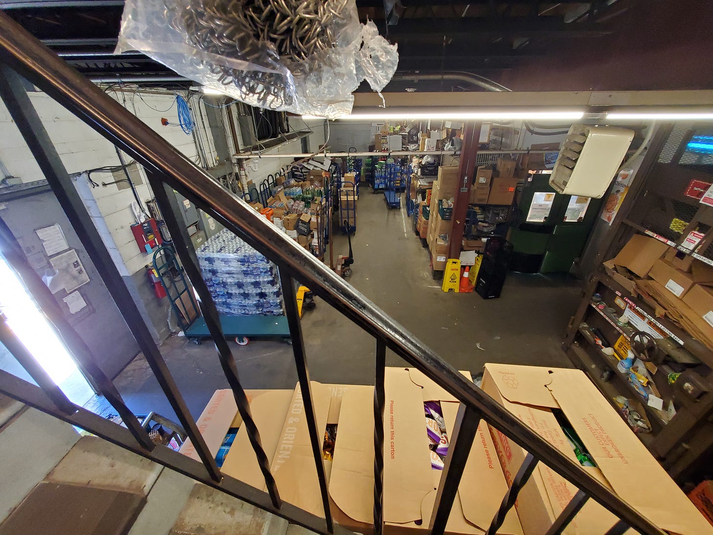
Where this generation of store really shows it’s age is in the bathrooms, I think. They’re sort of semi-public, often, as they are here, up a staircase by the breakroom rather than out by the sales floor as a clear customer amenity. Here’s what I saw when I visited the men’s room.
A seemingly employees-only door:
Which led to the stockroom and this staircase:
And finally the bathroom and a breakroom with a sort of passive-aggressive sign addressed to employees. That sign might be an antique these days! I’d love to know how old it is; I think it must date back to the A&P days.
It’s a little weird, as a customer. But in 1960, it was probably the most modern thing in the world.
These stores are not special or interesting; they’re just grocery stores, circa 1950-1980. The fact that they embody a lot of good urban planning doesn’t mean they got it right, so much as that we’ve since gotten it very wrong.
Related Reading:
Secondhand Supermarkets, Part II
Thank you for reading! Please consider upgrading to a paid subscription to help support this newsletter. You’ll get a weekly subscribers-only post, plus full access to the archive: over 500 posts and growing. And you’ll help ensure more material like this!


This reminds me a bit of the arc of a supermarket in the Boston neighborhood of Jamaica Plain. It opened in the 1960s as Sklars, a standard supermarket that also catered to Eastern European and Irish immigrants. It then became Hi-Lo Foods, which served the Latino community. The neighborhood around it has been gentrifying, and about a decade ago, it was converted into a small format Whole Foods. Very similar footprint to what you're showing here and likely still alive in that footprint because it's in a walkable, urban area.