Fossiling
Little stories all around us
These pictures might or might not be mildly interesting to you:
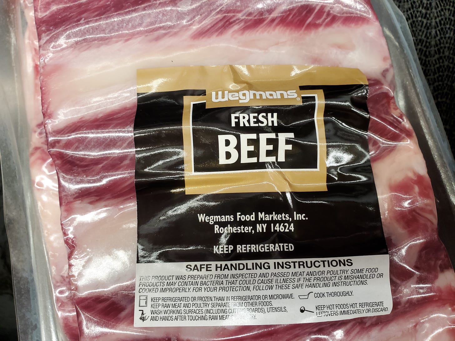
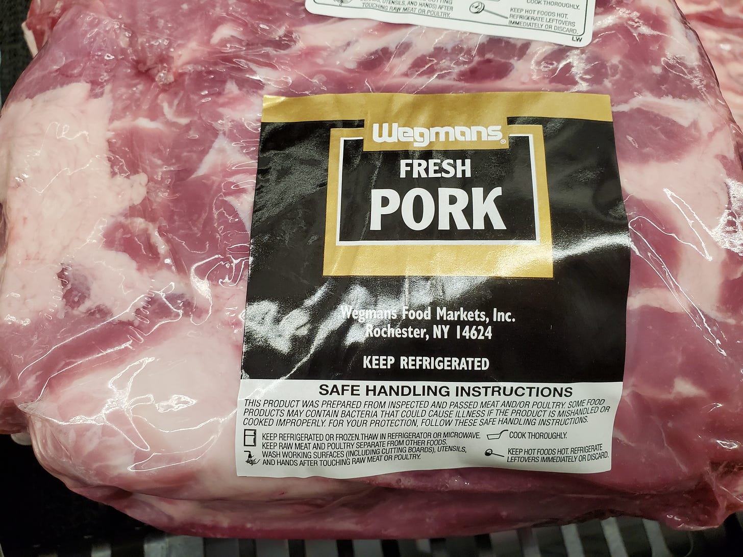
These are from Wegmans, a regional Northeast/Mid-Atlantic supermarket chain (which happens to be my favorite supermarket, and which I’ve shopped at in every state I’ve lived in).
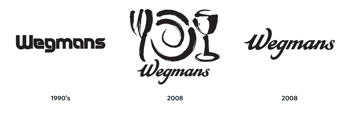
What’s interesting here is that the logo on these packages—that solid, bold font—has not been the actual Wegmans logo since 2008! These are possibly the only products left among the many Wegmans store-brand products that still use the old logo. The bleach cleaner has been updated since I took this photo. The coffee filters and, I believe, the meats are current. (All the other meats use the new logo.)
Here’s a list of all the Wegmans logos over the years and the years they were adopted, going back to the company’s founding in the 1930s, from their website. It shows, among a lot of others further back, this:
The stores’ signage have pretty much all been updated with the new logo for a long time. It’s a curious thing to me—a whole question of the inner workings of companies, printing and design facilities, etc.—how you end up with a tiny handful of old-school product labels that are just never updated. The only way anybody new to the store would know there had even been a previous logo.
What rule or guideline does the company have to determine when a product label gets updated? Obviously all post-2008 new products will have the new logo. But maybe only when a product changes in some way, necessitating a new label anyway, did the logo also get changed? Maybe these stragglers are just identical going back to pre-2008, and the company judged that total branding conformity wasn’t worth the cost of a redesign? How much could swapping a logo on an image cost, anyway?
You can observe something similar when a supermarket adopts a new “decor package,” as they’re called, but some element of the old ones—a piece of wall decor, the color of the bumpers around the open freezers, the tile backsplashes in the fish or butchers departments—remains. For example, in one of the Giant supermarkets I frequent, there’s a warning sticker on a door that uses an old color scheme/font, but the rest of the store’s visual elements have been updated to a more recent color scheme/font.


