I saw this tweet the other day from Dan Reed, an urbanist in Montgomery County, Maryland:

Here’s a Google Street View image of the sign and building, which are pretty retro and cool:
Were those apartment towers there in 1950? Probably not. Whenever you see something like this in what today looks like an urbanized area, it’s a good indication that the area has changed dramatically in the last few decades. It’s similar to this neighborhood in Arlington, which was suburban up until the 1980s. This retro IHOP gives its former history away.
I like the idea of keeping the signs from these old places, a lot. It allows “change with continuity.” These things might just be bits of commercial flotsam and jetsam. They don’t mean much—not monuments, not usually deserving of historic preservation. But they’re receptacles of memories. They’re physical and emotional landmarks for people over more than half a century, and I do think that alone means something.
Keeping the sign and letting the building go allows that meaning to be acknowledged, as well as the need for things to change after 70 years. I don’t think these things have to be opposed to each other. Finding a way to have change with continuity is how great places evolve.
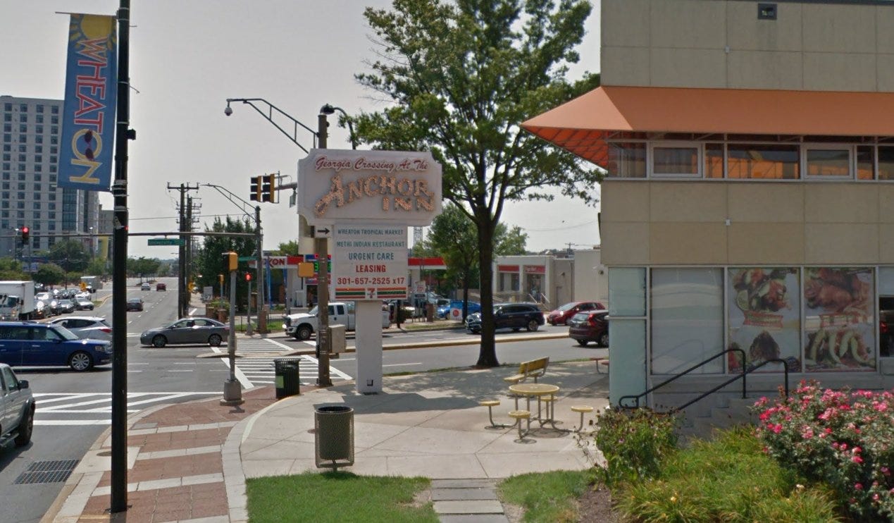
This is actually done occasionally. I’ve seen a couple of examples in the D.C. area, and one (sort of) back up in New Jersey. Here’s one in Wheaton, Maryland not far from Silver Spring. This was an old restaurant redeveloped as a two-story shopping center. The sign was refurbished and kept, but the building is completely gone.
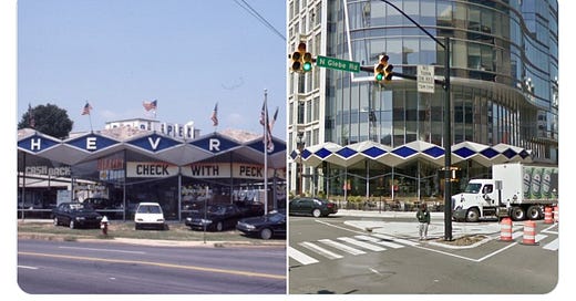
The other one, in Arlington, Virginia—not far from that IHOP—is a half example. The colorful canopy around this office building is new construction, but it’s an exact copy of the canopy that surrounded the previous building, which was a car dealership! Here they are side by side:
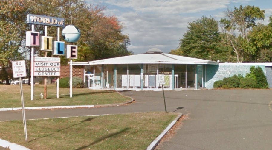
The New Jersey example is a sort-of because it isn’t the whole sign, and it isn’t on location anymore. See this now-demolished tile store, on U.S. 22 in Springfield? Look at the globe on the sign.
It now hangs above a bar in Brooklyn!
Now, as with beautiful architecture, as I noted in last week’s subscribers-only post, the point of this isn’t to appease NIMBYs, who, as Groucho Marx put it, say “whatever it is, I’m against it.” If someone is showing up at a public meeting to oppose redevelopment of a 70-year-old dry cleaners, they don’t care about the sign.
But I’d like to think it might matter to a lot of ordinary people who are a little uncomfortable with lots of change and development. For me, the issue is acknowledging that what was there was a part of the community for a long time. I find it distressing on a certain level when such a landmark is just unceremoniously torn down—as if it never existed. I wrote, last week, “I’m the kind of person who almost never likes it when a company updates a logo. It feels like a common touchstone and mental landmark is being taken away unilaterally.”
That’s the extent to which redevelopment of small-h historic properties bothers me. Keeping the building isn’t usually what I care about. That would only be a means to an end of getting that acknowledgement. Keeping the sign would be good enough for me.
Have you ever heard this discussed before, in the context of redevelopment proposals? Have you ever seen a historic sign on a new property? It would be cool if “keep the sign” became a sort of best practice when working on these old properties in growing areas. Let me know your thoughts!
Related Reading:
Do NIMBYs Love Beautiful Buildings?
Please consider upgrading to a paid subscription to help support this newsletter. You’ll get a weekend subscribers-only post, plus full access to the archive of over 300 posts and growing—more than one full year! And you’ll help ensure more material like this!


My friend used to live one block from the arlington Ihop. It's the most interesting thing in that area. They should leave the dry cleaner alone. Its kinda rare for dry cleaners to go out of business, the usually get sold to other drycleaners.
Related: https://nypost.com/2015/05/21/cbs-throws-david-letterman-set-into-dumpster/